Tag Archives: galaxyzoo

Galaxy Zoo iPhone/iPad app

A few weeks ago I finally released my iOS app for Galaxy Zoo on the Apple App Store. Now that it’s been used a bit and I’ve had the chance to fix a couple of crashes, I’m announcing it properly. I am a little afraid of harsh reviews but please try it out and  be kind.

I’m still not quite as comfortable with it as I am with my Android app for Galaxy Zoo, partly because I just don’t feel at home with Objective-C and because iOS lacks something like SyncProvider. But it seems to work.

I actually finished writing the app about eight months ago, but I had to wait until Apple gave me permission to use the old “Galaxy Zoo” app name, allowing this app to appear as just a new version of the old (withdrawn) Galaxy Zoo app from 2014 or so. Joe Zuntz, who wrote the old app, was very helpful with that, pestering Apple until it happened. Unlike that old app, it should be possible to keep this one working even if the server changes, because it’s open source on github.

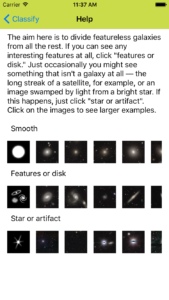
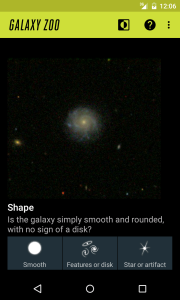
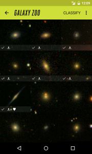
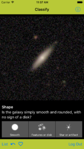
Here are some screenshots:

screenshot_iphone_4p7inch_classify
screenshot_iphone_4p7inch_list
screenshot_iphone_4p7inch_help

Galaxy Zoo app for iPhone: Learning iOS Development

My Android app for Galaxy Zoo is doing pretty well. Creating it gave me a chance to learn Android development quite thoroughly. So I thought I’d do the same for iOS, with Objective-C. The Galaxy Zoo iPhone app is now mostly done, though it’s only available via TestFlight for now. Please send me your Apple ID (usually your email address) if you’d like to try it.

Over the years, I didn’t much believe the reports of Apple’s APIs, tools, and documentation being so wonderful. But I had hoped things would be better.  Android’s API and documentation can be frustrating, but developing for iOS feels worse, with rather primitive tools. It’s still doable, but I can’t think of anything about it that I prefer to Android development.

This is a rough collection of rants, so I reserve the right to revise my opinion when I have gained more complete understanding.

Objective-C

Learning Objective-C was not too difficult, though I still find its syntax and terminology arbitrarily different and often obstructive. Watching all of Stanford’s “Developing iOS 7 Apps for iPhone and iPad” course (on iTunes here too) helped me gradually get used to Objective C, XCode, and Apple’s *Kit APIs.

I chose to start with Objective-C rather than Swift, just so I’d have a chance to learn it and to avoid any problems caused by Swift still being fairly new. I plan to convert my code to Swift soon as its gradually becoming the default language for iOS development. Unfortunately it looks like Swift inherits most of Objective-C’s weird features.

Whereas in Java or C++, you would call a method on an instance like this:

SomeResult *someresult = something.somemethod(arg1, arg2);

in Objective-C, you’d send a message (not call a method) to an instance, like this:

SomeResult *someresult = [something somemethod:arg1 witharg2:arg2];

And if something is nil (null) then, unlike C++ or Java, there will be no runtime crash or exception – you’ll just get a null result. So you don’t need to check for nulls unless you really need the method to be called, though this leads to all kinds of extra implicit paths through your code. I secretly like this, but it is of course madness.

Users of C++ or Java will also be shocked at how it’s normal in Objective-C to add API to already-defined classes instead of providing the API via derived classes or helper methods. For instance, when using the (not from Apple) AFNetworking library, you can #import “UIImageView+AFNetworking.h” to add methods (messages) such as setImageWithURLRequest to the regular UIImageView class.

XCode

XCode is overly simple when it comes to basic code editing and debugging. I was amazed that I couldn’t just click on an exception’s backtrace to go to the relevant line of code. And I really missed the refactoring features in Android Studio or Eclipse.

XCode is not intuitive, forcing you to learn where to click and when, instead of learning how some structured code works. For instance, you need to know about the magic Ctrl-drag to access UI controls in your code, to respond to UI events from those UI controls.  Embedding your views into tab bars and navigation views is similarly obscure.

Auto Layout

Nothing has frustrated me more than Auto Layout in iOS. Amazingly, iOS had no real automatic layout until iOS 6 in 2012, and I don’t think it was really usable until iOS 7 in 2013. And developers still needed separate layouts (Storyboards) for iPhone and iPad versions of their apps until iOS 8 in 2014.

Auto layout seems to be a matter of playing with:

  • Constraints: You can add constraints, for instance to say that a child view (widget, control) should be the same width as another view , or that it should have a certain size of margin between itself and the leading (left) edge of its container. The XCode UI makes it really hard to see what constraints exist and the XML is obfuscated, so this is really difficult. You still need to specify positions and width/height for all your views, even if they would be changed by the auto layout, so you inevitably have to keep dealing with XCode’s warnings about the “frame” not being the same as it would be at runtime.
  • Content Hugging (vertical or horizontal): A high value stops the view from being made larger, instead “hugging” its content (such as text). I dislike this terminology particularly.
  • Compression Resistance (vertical or horizontal): A high value stops the view from being made smaller.

Content hugging and compression resistance are numeric values, so your layout tends to become littered with arbitrary values such as 100, 250, or 1000, as you try to make things work, with very little sense of overview of the whole layout.

I much prefer the automatic layout systems used in GTK+ and Android, where it’s mostly just a matter of using parent layout containers and telling them how to arrange their children. Android’s layout system is often cryptic, compared to GTK+’s simplicity, but the layout XML is readable so it’s fairly easy to try things out. Stackoverflow answers about iOS autolayout are all about where you should click in various versions of XCode, but the answers about Android layouts can just show XML samples.

Android child fragments can be difficult, but I eventually worked things out. In iOS/XCode still don’t have a satisfactory way to auto layout child containers that contain child views.

CoreData

CoreData seems to be a way to access a SQL-like database using generated classes. For instance. I find the manual code generation quite awkward, but I suppose it works. Most of my difficulties were to do with using CoreData with RestKit. But I eventually found its saveToPersistentStore() method to actually store the data reliably.

I’ve also missed having an equivalent for Android’s SyncAdapter, though I have not yet found the same UI performance problems that made it so necessary on Android.

Beta testing

I can understand Apple’s insistence on reviewing all app uploads to their app store. But it’s annoying that every version of private beta tests have to be approved too.And

To let someone beta test your app via TestFlight, you need to know their Apple ID and add it manually in the iTunes Connect website. In comparison, with Google’s Open Beta Testing for Android, you can just publish a URL that lets people opt in themselves.

And as far as I can tell, users don’t get any notification when you release a new beta version. So your old testers generally don’t even install the new version until you’ve bugged them individually to do so.

android-galaxyzoo: Fixing typical Android bugs

My Galaxy Zoo app for android has been on the Play store for several months now and seems to be generally well liked. So far it has around 800 users, increasing slowly and linearly, probably because it isn’t linked from the galaxyzoo.org website. But even the first hundred users were enough to show me several problems that I needed to fix. I’ve written about them here, with links to the commits that fixed them in my app, because other app developers will experience them too.

These were general Android development problems, not specific to android-galaxyzoo. I guess that this is the difference between someone who understands how the Android API should be used, and someone who has actually used it with real users. It shouldn’t be quite this difficult.

Work in the main thread (Strict Mode)

Your code should not perform long-running tasks, such as network or disk IO, in the main thread, because UIs should not be unresponsive. By enabling Strict Mode in your code, you can make this cause exceptions, turning a non-responsive app into a crashing app. It would be unwise to turn this on in your app’s release version.

However, some “power” users seem to have this on via the developer options. They probably experience instability in many apps. And Android 3.0 (Honeycomb) has some Strict Mode settings on by default. So you will get crash reports via the Google Play store if you ignore Strict Mode exceptions.

As I mentioned in my previous entry, AccountManager is documented as being safe for use on the Main UI Thread, but it’s not, so I needed to use the AccountManager via AsyncTask.

If you are using a ContentProvider, you should not try to store data in the ContentProvider in the main thread. I instead did that via AsyncTask.

Likewise, avoid calling BitmapFactory.decodeStream() in the main thread, though it’s easier to just use Picasso anyway.

Automatic cache deletion

Your app probably caches some data, such as images, in its cache directory, such as the getExternalCacheDir() directory (/storage/sdcard/Android/data/com.you.yourapp/cache). However, Android will delete those files whenever it needs the space, and it won’t explicitly tell your app that it’s happened. So you need to check that your cached files really exist, one by one. You can either check the files when you first try to use them (causing UI delay) or you can check in the background, maybe trying to re-download the files.

This confused my code completely and it was hard to identify the cause of the resulting bug because the cache deletion by the system was not triggered by any particular action in my app.

By the way, although the getExternalCacheDir() documentation says that you don’t need to request permission to use that (app’s own) directory since Android 4.4 (KitKat), that’s not true – you do need to request the permission on Android 5.0 (Lollipop).

IllegalStateException: Can not perform this action after onSaveInstanceState

There are things that you cannot do in between an activity’s state being saved and that activity being resumed. It’s hard to know when that is the case but if you get it wrong then your app will crash. Here’s a full explanation, though you’ll wish you didn’t have to bother with it.

For instance, you should delay any use of AlertDialog until the parent activity’s onResumeFragments, which I did like so.

Likewise, you should not commit fragment transactions until after your activity has resumed. Again, its best to cause the commit of the fragment transaction in the parent activity’s onResumeFragments() because there’s nowhere suitable to do that in the fragment. The code could be much simpler if there was just somewhere safe in the Fragment to do this.

I believe that this problem hits every Android app developer who ever had more than a handful of users. It feels like a failure in the Android API design and the fixes feel like workarounds. If there was any clear way to structure app code to avoid this from the start then that would be mentioned early in the developer documentation.

Mutiple onLoadFinished() calls

If you use a ContentProvider (as I think you should) then you’ll use a Cursor Loader to get its data, overriding onCreateLoader() and onLoadFinished() and calling getLoaderManaged().restartLoader().

However, you will notice that your onLoadFinished() is often called more than once, sometimes with older data, confusing your app. This can be avoided by calling getLoaderManager.destroyLoader() in your onLoadFinished. For instance. I’m fairly sure this is an Android bug – at the least it is a poorly documented and unforgiving aspect of the API.

ConcurrentModificationException

I had at least one crash report with a ConcurrentModificationException, suggesting that two threads were changing the same data at the same time though I thought I had designed my code to avoid that and I thought I had made the class mostly immutable. So to avoid any chance of sharing data between threads I did some defensive copying (and here). I haven’t seen the crash since.

Toolbar’s Up button doesn’t act like the Back button

Android has a standard Back button that most users understand. It generally takes the user to the previous screen (activity), and that previous screen will look like it last looked for them.  But Android also has the concept of an Up button which few users understand.

The Up button is usually at the left of the app’s top toolbar (appbar) and it usually looks like a Back button. But it’s not a Back button. It takes the user to the parent level of the app instead of stepping back through all the previous screens that the user has traveled through since they were last at the top-level. Of course, most users don’t have any concept of the app having a hierarchy of screens in addition to a history of sibling screens. I predict that the Up button idea will be removed from Android one day.

At a second-level activity (something opened from the top-level), a user can justifiably expect the Back button and Up button to have the same effect – take me to the previous (top-level) screen/activity – even if the user knows about the Back/Up difference. However, by default the Up button will start a new parent activity instead of going back to the previous instance of that activity (as Back would). Users experience this as a loss of data – for instance this bug and this bug.

The fix for this depends on the situation:

Duplicated child fragments

My app uses child fragments (fragments in a fragment), which Android needs us to add in code rather than in the layout XML file. Strangely, I sometimes saw duplicate fragments thought it was hard to reproduce it reliably. The answer was to  always use FragmentTransaction.replace() instead of add().


Galaxy Zoo Android app: New Surveys

The web-based Galaxy Zoo has switched to showing subjects from two new surveys, with new sets of questions for these surveys. So I’ve updated (see in github) the Android app too and the new version is now available in the play store. These new images are less clear, and the questions are a little harder to answer. Apparently some clearer images are on the way.

Unfortunately, though the data comes from the server, all of the decision trees, icons, help text, and example images need to be in the client – The web client and the Android app at the moment. I’ve written a small text document describing how to change the surveys used by the Galaxy Zoo Android app. It should be easier, but for now documented-and-awkward is better than not-documented-and-awkward.

android-galaxyzoo: Superficial porting to Android 5.0 (Material design)

Here are some notes about my experience adapting android-galaxyzoo to Material design for Android 5.0 (Lollipop) though I only used the most superficial parts of Material design.

AppCompat v21

Android 5.0 (Lollipop) has a new UI theme and some new APIs. However, for the next few years, almost everyone will use the slightly awkward AppCompat v21 compatibility API instead to achieve most of the same behavior on older devices too. Chris Banes wrote up a nice overview of AppCompat v21, some of which I mention here again for completeness.

I’m using Gradle, as should you, so I added this to the dependencies block in my app/build.gradle file. You’ll want to use the latest version.

compile "com.android.support:appcompat-v7:21.0.3"

Theme

First, I switched from the dark Holo theme to the (AppCompat) dark Material theme by changing the parent theme in my styles.xml. See the Toolbar section below about the use of the “.NoActionBar” versions of these themes.

- <style name="AppTheme" parent="android:Theme.Holo">
+ <style name="AppTheme" parent="Theme.AppCompat.NoActionBar">

If you were using the light theme, that would be:

- <style name="AppTheme" parent="android:Theme.Holo.Light">
+ <style name="AppTheme" parent="Theme.AppCompat.Light.NoActionBar">

Note that we don’t use the android: prefix with the AppCompat theme, because the theme is being bundled directly into our app via the appcompatv21 library.

I then specified  the standard colorPrimary and colorAccent colors along with some more shenanigans to get the right text and icon colors in my toolbar.

I also used the TextAppearance_AppCompat_* widget styles instead of the regular textAppearance* style attributes, because it’s recommended in the Typography section of this official “Implementing Material Design in Your Android app” blog entry. However, I didn’t notice any difference in appearance, and I wonder why we wouldn’t just get the correct styles by just using the new overall theme.

I actually created a base style and two derived styles, to support Transitions – see below.

Toolbar

The new Toolbar widget replaces the ActionBar, though the documentation doesn’t actually say that yet. Generically, they are called the “App Bar” in the Material Design document. I’m not sure that I really got any benefit from using it because my App Bar doesn’t do anything special, but I wanted to use the latest API.

To use Toolbar instead of ActionBar,  you should derive from the .NoActionBar version of the theme, such as Theme.AppCompat.NoActionBar, though I used the regular Theme.AppCompat for a long time without noticing any difference.

Then you’ll want to add a Toolbar widget to the Layout XML files for every activity. I did that by creating a toolbar.xml file

<?xml version="1.0" encoding="utf-8"?>

<android.support.v7.widget.Toolbar
    xmlns:android="http://schemas.android.com/apk/res/android"
    xmlns:app="http://schemas.android.com/apk/res-auto"
    android:id="@+id/toolbar"
    android:layout_width="match_parent"
    android:layout_height="wrap_content"
    android:background="@color/color_primary">
</android.support.v7.widget.Toolbar>

and then I just including that from all the activity layouts like so:

<include layout="@layout/toolbar" />

I also specified the app:theme and app:popupTheme to get the right text and icon colors in my toolbar.

To use this toolbar as the App Bar, you need to derive from ActionBarActivity and call its setSupportActionBar() method. I did that in a utility function, like so:

Toolbar toolbar = (Toolbar) activity.findViewById(R.id.toolbar);
activity.setSupportActionBar(toolbar);

RecyclerView

Android 5.0 adds the RecyclerView widget, available for older API levels via the support.recyclerview library. For instance, I added this to the dependencies block in my app/build.gradle file. You’ll want to use the latest version.

compile 'com.android.support:recyclerview-v7:21.0.0'

RecyclerView apparently replaces ListView and GridView, though the documentation doesn’t yet actually say that, adding confusion for new developers. I replaced my use of GridView with RecyclerView to get support for simple Material Design transitions.

Unfortunately, RecyclerView has no real cursor support, so it’s hard to use it to view data from a ContentProvider. This is particularly annoying because the API of ListView and GridView previously pushed us towards moving code into a ContentProvider. My own Cursor-based RecyclerView.Adapter is terribly inefficient and totally unsuitable for a large number of items.

There’s an awful lack of practical documentation or example code for RecyclerView, even for simple tasks like responding to a click. Until there’s an easier way, you’ll need some tedious boilerplate code to derive your RecyclerView.ViewHolder from View.OnClickListener and call setOnClickListener() on one of your child views.

Transitions

I wanted the typical move-and-scale transition that we see in Material Design apps, so that clicking on one of many items makes its image expand and move into the subsequent detail activity, and shrink back again when you go back.

To achieve this, I had to specify various settings in my theme, but only Android 5.0 (Lollipop) devices support these transition items, so I created a base theme in res/styles.xml, and derived from it:

<?xml version="1.0" encoding="utf-8"?>
<resources>

    <style name="AppTheme" parent="AppTheme.Base" />

    <style name="AppTheme.Base" parent="Theme.AppCompat.NoActionBar">
        <item name="colorPrimary">@color/color_primary</item>
        ...

I then created a styles.xml file just for API Level 21, by putting it in res/v21/styles.xml, where I derived from the base theme again:

<?xml version="1.0" encoding="utf-8"?>
<resources>
    <style name="AppTheme" parent="AppTheme.Base">
        <item name="android:windowContentTransitions">true</item>
        <item name="android:windowAllowEnterTransitionOverlap">true</item>
        <item name="android:windowAllowReturnTransitionOverlap">true</item>

        <!-- specify shared element transitions -->
        <item name="android:windowSharedElementEnterTransition">
            @transition/change_image_transform</item>
        <item name="android:windowSharedElementExitTransition">
            @transition/change_image_transform</item>
    </style>
</resources>

I then defined that change_image_transform transition in my res/transition/change_image_transform.xml file, like so:

<?xml version="1.0" encoding="utf-8"?>
<transitionSet>
    <changeBounds/>
    <changeImageTransform/>
</transitionSet>

To actually use this transition on images, I needed to specify the android:transitionName on the two ImageViews in the the layout XML files for the two Activities (Fragments in my case).

Mostly this was all voodoo which I put together gradually after finding clues scattered around the internet. I haven’t found a good official example that shows this.

Unfortunately, the transition doesn’t seem to work when the user presses the Up button on the toolbar instead of using the standard Back button, even though that’s indistinguishable from Back for most users in most activities.

Metrics and Keylines

I made a fair effort to adapt my margins and padding to fit in with the Material Design Metrics and Keylines, which wasn’t too hard.

Unfortunately, the standard Android Button’s appearance is just as usless for Material design as it was for the Holo theme. It has a fake margin around its inside edges, which is part of its background graphic rather than any adjustable margin or paddng property.

So, to make the button’s sides actually flush with other widgets, and to position them properly on the layout grid, I had to specify a custom background image or color. But then I lost the nice Material Design ripple effect. I hope someone knows how to do this properly.

Activity classes without Toolbar support

There are a few helpful derived activity classes, such as AccountAuthenticatorActivity and PreferenceActivity, but these haven’t been changed to derived from ActionBarActivity, so you can’t call setSupportActionBar() on them. They can’t be changed without breaking compatibility, so you’ll have to reimplement them in your code. It’s not a lot of code but it’s an unpleasant developer experience.



Galaxy Zoo for Android

I just released my Galaxy Zoo android app to the Google Play store. The Zooniverse team have adopted it as their official Galazy Zoo app for Android.

Like the Galaxy Zoo website, it asks you questions about a picture of a galaxy, with each question depending on the previous question. This “Citizen Science” helps astronomers to analyze the huge amount of images of galaxies provided, for instance, by the Hubble Space Telescope. There are several other Zooniverse projects, though most require more thought and have more complicated user interaction.

screenshot_nexus4_api21_classify_first screenshot_nexus4_api21_list

I have already released several beta versions to a handful of helpful testers, but now I’m nervous about it being publicly available. I’d rather not be bombarded with one-star reviews if there’s a bug I haven’t caught yet or if people don’t like something about the questions themselves.

There was a previous Galaxy Zoo android app that I think was in use until around 2012, but it stopped working with the latest version of the server and apparently wasn’t updated. It’s no longer available from the Google Play store. This new Galaxy Zoo android app is open source on github, so it should have more future. For instance, that would let other developers investigate problems if there are server changes, even if I don’t (though I would). Patches and pull requests are very welcome. There are even a few minor issues that I’d already like help with.

I’ve been working on this for the past few weeks, using it as a real-world exercise to learn about Android development, trying to do everything properly. I’ve enjoyed diving into something new, and it feels good to have gained the experience. However, Android development ultimately feels just as awkward as every other development environment I’ve ever worked with – no more nor less. I’ll write some follow-up blog entries about the technical parts of the adventure.


Looking at the Zooniverse code

Recently I’ve been looking over the Zooniverse citizen science project and its  source code on github, partly because it’s interesting as a user and partly because I thought writing an Android app for Galaxy Zoo would be a good learning exercise and something useful to open source.

So far my Android app can’t do more than show images, but I thought I’d write up some notes already. I hesitate to implement the Android App further because the classification decision tree is so tied up in the web site’s code, as I describe below.

Hopefully this won’t feel like an attack from a clueless outsider. I’m just a science enthusiast who happens to have spent years developing open source software in various communities. I’ve seen the same mistakes over and over again and I’ve seen how to make things better.

Zooniverse is organised by the Citizen Science Alliance (CSA). Incidentally, though the CSA has an organizational structure, I can’t see it’s actual legal form. Is it a foundation or a company? The zooniverse.org and citizensciencealliance.org domains are registered to Chris Lintott. Maybe it’s just a loose association of researchers with academic institutions assigning funds to work they care about, and maybe that’s normal in academia. The various Zooniverse employees actually seem to work for the member organisations such as the Adler Planetarium or the University of Oxford, though I guess some funding is for specific Zooniverse projects and some funding is for the overall Zooniverse development and hosting. That probably makes coordination difficult, like a big open source project.

Open Source

Since early 2013, the main Galaxy Zoo project has the code for it’s website on github along with the Zooniverse JavaScript library that it shares with other Zooniverse projects.

But most projects highlighted at zooniverse.org (such as Planet Four, Asteroid Zoo, Moon Zoo, or Solar StormWatch) don’t yet have their website’s code on github. This looks like a worrying trend. It doesn’t look like open sourcing has become the default as planned.

The zooniverse github repositories list is a poor overview, particularly because most of the respositories have no github description whatsover. Github should make them mandatory, even though they’d need to be updated later. Most projects don’t even have a basic description in their README.md either. Furthermore, I’d like to see a clear separation between front-ends, server-side code, and utilities (for processing data or for installing/maintaining servers.), maybe presented out on a github wiki page.

Also, they apparently have no plans to open source the server-side code (Ouroboros at api.zooniverse.org) that serves new subjects (such as galaxy images) to classify and receives classifications of these subjects. I think I’ve read that it’s a Ruby-On-Rails system. The client-side and server-side code is tightly bound, so this is a bit awkward. There is clearly room at least for some of the data structure and descriptions to be abstracted out and shared between the server, the client, and the analysis tools.

I can’t find any real documentation about the various Zooniverse code or APIs so there’s an awful chance of this blog post being the only introductory documentation that exists. I’d really welcome corrections and I’d gladly help. Neither can I find any place for public discussion of the software’s development, such as a mailing list. It’s hard for any open source project to mature without at least somewhere to discuss it.

Code

Arfon Smith at Zooniverse wrote some blog entries about the Zooniverse Domain Model, Tools and Technologies, and Server-side logic (my title).  (Arfon has since left Zooniverse to work at Github). I also found some useful  documentation at the zooniverse npm.org page. But I had to look at the code and the network traffic to get a more complete picture.

Languages, Libraries, Frameworks

The zooniverse front-end web-sites generally seem to be written in CoffeeScript (a mostly nicer language on top of JavaScript), using the Spine framework, which seems to make it easier to separate data and code into an MVC structure and to write code that deals asynchronously with the server while caching some data locally.

Some Coffeescript is written inline with the HTML, in Eco (.eco) files.

The CSS is written in the Stylus syntax, as expected by hem, which they use to bundle the code up for deployment.

I’m no JavaScript expert, but these seem like fairly wise choices.

Zooniverse web sites communicate with the Ouroboros server using RESTful GET (get subjects to classify) and POST (return a classification of a subject) HTTP requests, using JSON syntax. I think the JSON syntax is generated/parsed by the base Spine.Module.  I don’t know of any implementation-independent documentation for this web API.

The website code uses the Zooniverse library  as a helper to communicate with the server, for instance to login, to get subjects, and to submit classifications, and to support the lists of recent and favourite subjetct. The Zooniverse library is also implemented in Coffescript. Strangely, the generated JavaScript is also checked into git. The Api class seems to be most interesting..

Questions and Answers

Let’s look at the Galaxy-Zoo website though its maybe the most complicated. It allows users to classify images of galaxies. Those images may be from one of several astronomical surveys, such as Sloan or UKIDSS. Each survey has an ID and a Workflow ID listed in config.coffee (with much duplication of magic numbers). Each survey has a human-readable description and title in the list of English strings.

Each survey has a question/decision tree under app/lib, such as Galaxy-Zoo’s sloan_tree.coffee.  I wonder if this generated or duplicated from somewhere in the server software.  Why are the long question titles duplicated and used as IDs for leadsTo instead of using short codes? Is this tree validated somehow during the build?

These IDs, Workflow IDs, and decision trees are listed in the Subject class.

Question IDs

The zero-based index of the questions in the decision trees are used as IDs when submitting the classification. For instance, a submitted classification POST might contain the following parameter to show that, when classifying a Sloan image, for the “Is there any sign of a spiral arm pattern” question (sloan-3, and the 4th question asked of me) I answered “Spiral” (a-0):

classification[annotations][4][sloan-3]: "a-0"

These implicit IDs, such as sloan-3, are also used in the translations,  and throughout the code. For instance, to reuse some translation strings, to decide if there should be a talk-page link. That i18n hack in particular belongs as an association in the decision tree.

These implicit IDs are also used in the CSS (via the Stylus .styl files) to identify the relevant icons. The icons are in one workflow.png file in order to use the CSS Sprites technique for performance). The various sub-parts of that image are selected by CSS in common.styl.

This seems very fragile. It would be safer if the icon files were stored separately and then the combined file was generated, along with that .styl CSS. I guess that the icons are already stored separately somewhere, maybe as SVG. One parent file could define the decision tree and all the associated descriptions and icon files.

Ideally much of this structure would be described in configuration files separately from the code. That generalisation would allow more code reuse between Zooniverse projects and could allow reuse by other front-ends such as iPhone and Android apps. Presumably it’s this fragility that has caused Galaxy Zoo to withdraw its previous mobile apps. Even with such an improvement, you’d still need a proper release process to coordinate development of interdependent software.

Subject and Classification

Galaxy-Zoo has a Subject class, as does the Operation War Diaries project. These usually derive from the base Subject class in the zooniverse library  ,though the Snapshot Serengeti Subject class does not.

The Ouroboros server at at api.zooniverse.org provides a list of subjects for each group (a group is a survey, I think) to be classified via JSON. Here is the list of subjects for Galaxy Zoo’s Sloan survey. And here is the subjects list for Snapshot Serengeti with a simpler URI because there is only one group/survey.

The surveyId (for the group) for Galaxy Zoo is chosen randomly, though it’s currently hard-coded to always choose the Sloan survey. This JSON message contains the URLs of images for each  subject, in the list of “locations”. The Subject’s fetch() method calls the Api.get() method from the Zooniverse library and then creates Subjects for each item that the JSON message mentions.

The Subject’s constructor seems to take theJSON fragment to populate its member fields using the default Spine.Model’s AJAX functionality.

Galaxy-Zoo has a Classification class, and Snapshot Serengeti has one too. There doesn’t seem to be any common base Classification class in the zooniverse library. The Classification’s send() method calls the Classification’s toJSON() method before POSTING the message to the server via the Zooniverse library’s Api.post() method.

It’s hard to see any great commonality between the various projects.
For instance, a Galaxy Zoo classification is a series of answers to multiple-choice questions, with the questions being from a decision tree. I guess that Snapshot Serengeti’s animal classification is similar, though you can provide multiple sets of answers to the same questions about what animal it is and what it is doing, to identify multiple animals in each image. Moon Zoo and Planet Four ask you to draw specific shapes on an image and also classify each shape you’ve drawn, probably resulting in coordinates and identifications.

I wonder if the server-side code has any common model for these data structures or if the classifications just get fed into project-specific databases for project-specific data analysis later.