Light on Dark and Dark on Light.
Android’s has normal (dark) and light themes, though it’s actually the light themes which are normally show in examples of the new Material design.
The light theme expects your App Bar1 (Toolbar or ActionBar) to have a light background color, so it gives you a dark title and dark overflow menu icon (the three vertical dots):
The dark theme expects your App Bar to have a dark background color, so it gives you a white title and white overflow menu icon:
This is true of both the Holo themes and the new Material themes.
If you want to use the light theme but want your App Bar to have a dark background, or use a dark theme and want your toolbar to have a light background, things get awkward. Arguably this might be unwise design anyway, but there’s nothing in the Material design guidelines advising against it.
It’s fairly easy to change the ActionBar‘s text color, but changing the color of its overflow icon is harder. It seems normal to provide a whole new overflow icon for your app, replacing the standard one, just to get the right color.
Android’s new Toolbar, which replaces ActionBar (with some awkward code), makes it easier to change the title text color and the color of the menu overflow icon (and the Up/Back icon). So now I finally have dark text and icons on my light background in the dark theme:
Toolbar theme and popupTheme
It took me ages to figure out how to do this, so hopefully the following explanation saves someone some time. I’d welcome any corrections.
My main theme derives from Theme.AppCompat (not Theme.AppCompat.Light), which is the dark Material theme for older devices, because I want most of the UI to be dark.
<style name="AppTheme" parent="AppTheme.Base" />
<!-- Base application theme.
     Defining this lets values-v21/styles.xml reuse it with changes. -->
</style>
<style name="AppTheme.Base" parent="Theme.AppCompat.NoActionBar">
  <!-- colorPrimary is used, for instance, for the default ActionBar
       (but not Toolbar) background.
        We specify the same color for the toolbar background in
        toolbar.xml.. -->
  <item name="colorPrimary">@color/color_primary</item>

  <!-- colorPrimaryDark is used for the status bar (with the
       battery, clock, etc). -->
  <item name="colorPrimaryDark">@color/color_primary_dark</item>

   <!-- colorAccent is used as the default value for
        colorControlActivated which is used to tint widgets. -->
  <item name="colorAccent">@color/color_accent</item>
</style>
(Update: I originally used Theme.AppCompat, manually setting windowActionBar to false, before learning of Theme.AppCompat.NoActionBar here, but I don’t notice any difference)
But that dark theme gives me light text and icons on the my light background of the App Bar:
I want to use a light color for the toolbar background even while using the dark theme. So I’ll need to make the text and icons on my toolbar dark instead of the default white from the light theme. Incidentally, the Material Design Color Palette page seems to agree with me, using dark title text on the Lime color I’ve chosen, but using white on almost all other colors.
So my Toolbar’s XML layout specifies a different theme (android:theme, or app:theme when using appcompat versions before 22.1.0), like so:
<android.support.v7.widget.Toolbar
  xmlns:android="http://schemas.android.com/apk/res/android"
  xmlns:app="http://schemas.android.com/apk/res-auto"
  android:id="@+id/toolbar"
  android:layout_width="match_parent"
  android:layout_height="wrap_content"
  android:background="@color/color_primary"
  android:theme="@style/GalaxyZooThemeToolbarDarkOverflow"
  app:popupTheme="@style/Theme.AppCompat.NoActionBar" />
That toolbar theme specifies a textColorPrimary and textColorSecondary to change the color of the title text and of the menu overflow button. You could just specify the standard Theme.AppCompat.Light.NoActionBar theme for the toolbar, to get the dark text and overflow icon, but I wanted to derive from my own theme and make only small changes, because I have no idea what else might be affected.
<style name="GalaxyZooThemeToolbarDarkOverflow" parent="Theme.AppCompat.NoActionBar">
  <!-- android:textColorPrimary is the  color of the title text
       in the Toolbar, in the Theme.AppCompat theme:  -->
  <item name="android:textColorPrimary">@color/abc_primary_text_material_light</item>

  <!-- android:textColorPrimaryInverse is the  color of the title
       text in the Toolbar, in the Theme.AppCompat.Light theme:  -->
  <!-- <item name="android:textColorPrimaryInverse">@color/abc_primary_text_material_light</item> -->

  <!-- android:actionMenuTextColor is the color of the text of
        action (menu) items in the Toolbar, at least in the
        Theme.AppCompat theme.
        For some reason, they already get the textColorPrimary
        when running on API 21, but not on older versions of
        Android, so this is only necessary to support older
        Android versions.-->
        <item name="actionMenuTextColor">@color/abc_primary_text_material_light</item>
  <!-- android:textColorSecondary is the color of the menu
       overflow icon (three vertical dots) -->
  <item name="android:textColorSecondary">@color/abc_secondary_text_material_light</item>

  <!-- This would set the toolbar's background color,
        but setting this also changes the popup menu's background,
        even if we define popupTheme for our <Toolbar> -->
  <!-- <item name="android:background">@color/color_primary</item> -->
</style>
This gives me the dark text and icons in my App Bar while using the dark theme:
That’s actually gray rather than black, and the white icons are really off-white, so you might want to use a custom color to have real black or white standard icons:
<item name="android:textColorSecondary">@color/my_black_icon_color</item>
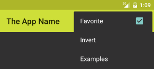
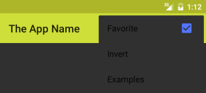
Notice that the <Toolbar> also uses popupTheme (app:popuptheme when using AppCompat, or android:popupTheme when targetting SDK >=21). Without this, the overflow menu’s appearance is affected by the Toolbar’s style, leading to dark text on a dark background:
By specifying the Toolbar’s popupTheme, we can make its menu use our normal theme instead:

[1] “App Bar” seems to be the new official terminology. It’s used here and some other places I can’t find now.
Also see my entry about changing the colors of your own action icons with Android 5.0’s drawable tinting feature.


Amazing article and very helpful. Good job.
There are so many ways you could play around with the new toolbar API.
For eg : You can use the Appcompat.Light theme and set your toolbar’s popupTheme to @style/ThemeOverlay.AppCompat which should give you the same result but without moding any other style properties :)
But I want to use the dark theme for everything in my app apart from the toolbar, not the light theme.
Could you be more specfic about what you suggest?
Thanks a lot. It was helpful for me.
As I can see, one problem here, icons like Back button and Overflow Menu is not really white, how to fix it to truly white color icons ?
Yes, in the dark theme, the icons are light gray, and in the light theme the icons are dark gray, even though the text will tend to be black or white by default.
You can change the icons apparently. For instance:
http://stackoverflow.com/questions/9733312/changing-overflow-icon-in-the-action-bar
However, for now I’m sticking with the defaults, assuming that there is some meaningful design behind it. But I wish that the Android design guidelines mentioned this.
Actually, you can just provide a simple color for the textColorSecondary instead of the standard abc_secondary_text_material_light. I’ve updated the blog entry.
Thanks so much! Wasted a whole day trying to figure out why the style attribute didn’t work with the Toolbar, needed app:theme instead.
Using textcolorsecondary also changes the colour of the bottom line in Edittext. How do i deal with this?
Thanks for this article. Saved lots of my time.
What I was trying for my app is.
Light theme with white color of overflow icon in toolbar and title and with custom (dark shade) toolbar background.
But My cab for light theme is with white background. So I’d want to change the overflow icon of cab to black. There is no guide for different icon color for toolbar and cab. Either I can set both to white or to black using text secondary color.
I got everything else up with the theme like popup color and other stuff, this is the only thing that’s causing glitch in my app.
Thanks.
Finally! Have this exact problem (bright yellow toolbar with dark them). Thanks two thousand camels!!!
popupTheme does not work for share action provider menu dropdown – I am getting black text on dark background there.
Any idea how to fix this?
Thanks.
I haven’t tried it myself, but I noticed (after writing this) that the AppCompat maintainer uses ThemeOverlay themes for this, so maybe that makes a difference:
https://chris.banes.me/2014/10/17/appcompat-v21/
Please let me know if that helps.
I’ve never found a good explanation of what these overlay themes are.
how to display text with custom icon in action bar
I can confirm that the ThemeOverlay worked and was fairly easy to implement. All I added was this to my Toolbar’s attributes:
        app:theme="@style/ThemeOverlay.AppCompat.Dark.ActionBar"

        app:popupTheme="@style/ThemeOverlay.AppCompat.Light"
Thanks for a great post! After playing around with this, it seems that for dark action bars with a light theme you can (now, anyway) inherit from Theme.AppCompat.Light.DarkActionBar.
Nice article. Saved me a ton of time and works out of the box!
Great post! Just what I wanted!
thank you for share your experience!
hey i have one doubt,in my project am using tollbar with different bg color,how to change menu overflow icon according to color..please help me
overflow icon color is not changing for me in htc pre lollipop device. in lollipop and above devices it is working perfect any idea?
THANK YOU SO MUCH, YOUR POST WAS THE ONLY IN THE INTERNET THAT SOLVED MY PROBLEM, I LOVE YOU SO MUCH NOW.
Text is unreadable. Got an headache trying to read gray on gray xml code :/
That seems like a bit of an exaggeration. But I have changed it – the XML now has a white background and syntax highlighting. Can you read it now?
Thanks a lot for this. It saved me a lot of time.